INCREASED CUSTOMIZED ORDERS BY 40%

Envelopes - Branding & Customize Modal

Envelopes.com (Owned by The Bigname Company) always try to keep things new, fresh, and the absolute best for their customers.

The branding and website were updated to feature all of their popular services, and we made the product pages more convenient to allow consumers access to all product sizes, styles, and colors without leaving the page. Envelopes.com now offers a better designer tool that will make it seamless to customize your envelopes the way you want them!

ROLE

Branding, Research and Usability Test

SCOPE

Customized Orders, Branding, Testing

TOOLS

Figma, Google Analytics

TEAM

Envelopes, Branding Brand

The Problem Statement

Envelopes is an online marketplace and one-stop shop for all kinds of envelopes. They have a unique value proposition. Consumers can easily find and purchase every variety of envelopes they could think of. They provide commission on all sorts of varieties ranging from paper envelopes, Packaging & Mailers, Folders, Paper & Cardstock.

And yet…

It’s not so easy for them to take requests for custom orders. Customers must add their requests in a small text box that appears during the checkout process, or send a follow-up email for them to be able to process the order.

Goals and motivations

  1. Our goals for the redesign:
    • To deliver a personalized experience and intuitive user interface
    • Propose a more engaging and seamless customizing experience so that users are comfortable by ordering customizable products
  2. My personal goals:
    • Take ownership of the various roles involved in designing a product such as a User Researcher, User Experience Designer, UI Designer for this particular module
    • Enhancing the conversions by increasing the number of customizable product orders while adhering to the new brand guidelines

Current Challenge

The below screenshot is a current flow of how users use to order customizable envelopes before the tool has been integrated into the product display page
After this step, the users usually had to manually write down the specification or attach a custom design file via email which was not so conventional.
There had to be a way all this could be made a lot easier which led us to dig deep into our solution to make the customizable flow effortless & easy

Research

To be able to implement a new solution we had to figure out what was working and what's not so below is the current flow of users ordering a customizable envelope.

We invited selected individuals who had previously ordered customizable products to participate in the study to understand their pain points

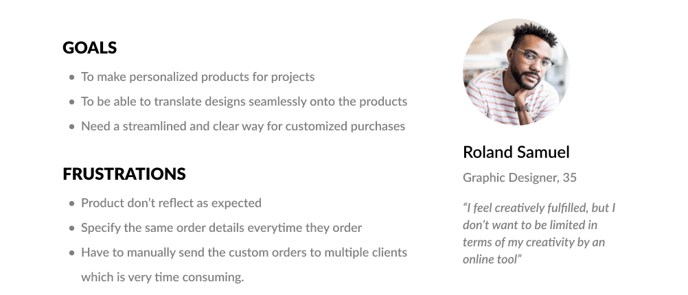
After interviewing with them and gathering the data we had earlier, we were able to create the following personas and we listed out their pain points and goals
After a brainstorming session with the users and the stakeholders, we had a lot of good ideas knocking our minds so we note them down on PostIts to decide which ideas were worthwhile exploring.

We created a matrix map to prioritize our goals and opportunities

Prioritization

We wanted to roll out this feature as soon as possible since the company loses money every month on custom orders. So, time was one of our biggest constraints.

We sat down and had meetings with our stakeholders to ensure we are all on the same page and over the course of further discussions, we decided to roll out the features which are very essential and prioritizing those which are necessary, and excluded those that are "nice to have"

We decided to prioritize the main pain points we got from our research and decided to go with

WYSIWYG Editor
Reusable Design
Customizable Category
Add Recipient Addressing in Bulk
Add a Return Address
Templates
In the Roadmap :

Mobile Version for customizer:

This was categorized as a nice-to-have feature according to the stakeholders & business goals, since most of our users (>80%) who order customizable products use desktop or laptop, although not excluded completely, this was in our roadmap planned for the next release.

Customizer option would still be available on the mobile, but it will just prompt to use the desktop to customize.

Wireframes

Does it work?

We have created our first set of mid-fidelity wireframes using Figma and put them together using Figma's prototyping feature we tested the strength of our proposed designs by asking users to navigate by giving them few tasks.

This is how it went :

Usability Testing 1

During the first round of our usability testing, we recruited 5 users. We have presented two variations of our first iteration. This was to decide if you want to go with the existing right pop-up slider or to go with the modal window.

We noticed that the users immediately were able to recognize the modal window and its purpose so we decided to go with the same

Iteration 1

Iteration 2

As per the feedback we received, we had added the address selection to the modal. This iteration solved the problem of adding bulk addresses during the customization process, which was crucial.

Usability Testing 2

We hired five more users to test our following mid-fidelity prototype iteration. We witnessed lots of improvements in this iteration that validated our design decisions. However, there were nagging problems with this version, the price estimate flow.

We observed that many users were confused by the price initially shown on the product page, and were surprised to see a different price at the checkout. They didn’t understand how the price was estimated for the design printing and bulk orders.

When creating our next iteration and high-fidelity prototype, we took to put this feedback to core and made several changes to Iteration 3.

Iteration 3

Proposed User Flow

Usability Testing 3

We put the prototype in front of five users,

The outcomes were mixed but many of our design decisions were validated which is a good sign.

Users could complete our tasks with minimal confusion and difficulty but they still hesitated around Task 3 & 5, especially the “Bulk Address & Seleting Addresses” they were confused or sometimes felt annoyed to type all addresses in fields.

We noticed that many users anticipated that the bulk address input was going to be as easy as they usually do from their excel sheet or google sheet. They found the address form input to be very much intimidating although some were able to complete the task successfully, it was annoying nonetheless. So we went back and discussed with the stakeholders to see how feasible it was to implement an excel sheet-like looking interface to solve this issue of entering bulk addresses.

We raised the fidelity to the complete prototype and were ready for another round of usability testing. Brainstorming with the creative minds of the branding brand team, we co-created and laid out branding guidelines to incorporate as a part of the design refresh for this year.


Branding

Solution

After three whole rounds of intense user testing, we were psyched to show off our colorful high-fidelity prototype. Our team at Dotcomweavers and Branding Brand have crafted our visual designs in Figma and ensure the composition and the aesthetics were adhering to the brand guidelines

High Fidelity Screens

We put those visual designs together and tested them out using the Figma prototype (with interactive components), We again put them in front of our potential users for more round of usability testing.

Below were the results: (Spoiler : we succeeded with flying colors)

Beta Testing

Before a production release, we released a beta version of the customizer to few selected users who agreed to test the customizer which would help us open our doors for further improvements.

A/B Testing

There was a debate among the stakeholders as to which version of the modal window needs to be agreed upon. So to solve this conflict we came up with the idea of a/b testing both the versions in the beta phase.

All the tests up until this point were only conducted using a closed group of selected users, to put the designs to a real test, we conducted an A/B test by serving version A to 50% of the users who choose to opt-in and test the beta customizer with one version B to the rest 50% of This was a crucial step, we were prepared to start over in case the test goes downhill.

The metric we considered to be successful among the test was

1.Successful Customization using the (WYSIWYG) online designer
2.Successful Bulk Address Upload (using CSV, XLS, or Editor)
3.Utilize the file upload function using the "Upload a design" feature.

Results

Variation B showed promising results with more than a 60% success rate over Variation A in terms of task completion. So Variation B was chosen.

Customizer was rolled out in phases and in the first phase of its launch, we measured over a 40% increase in custom orders.

Learnings / How to Improve

After phases 2 & 3 of beta testing with more users, and as we gather more insights and data, we could continue to improve the flow and iterate as necessary.

Although the ability to customize and place orders was a significant improvement from manual emails, we would like to explore the "nice to haves" ideas of the effort matrix charts.

The Future

At the time of writing this case study, the mobile version of the designer/customizer was put on hold as we had to deal with some technical & compatibility challenges presented by the developer teams and but it is still on our roadmap for future release.


pencil