Here are some Assumptions made before jumping into the UI Design
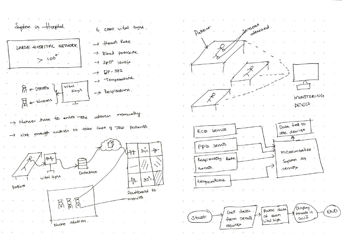
The Research behind the process:


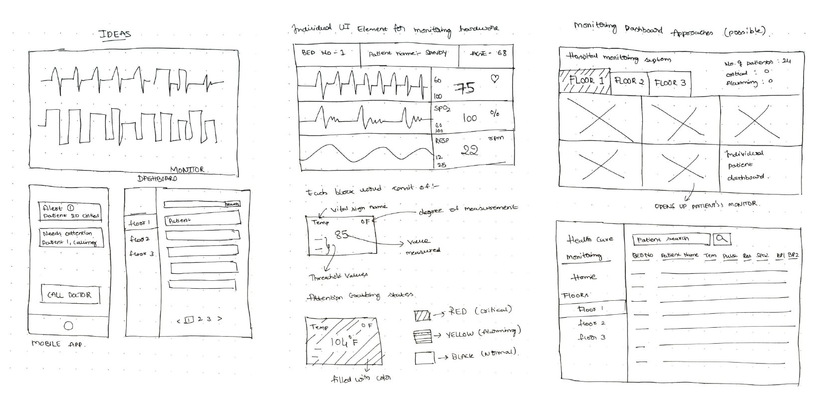
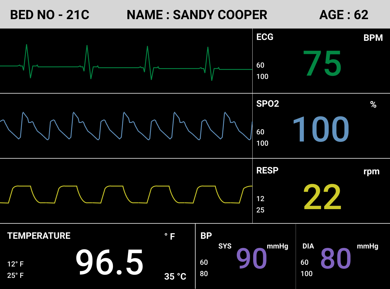
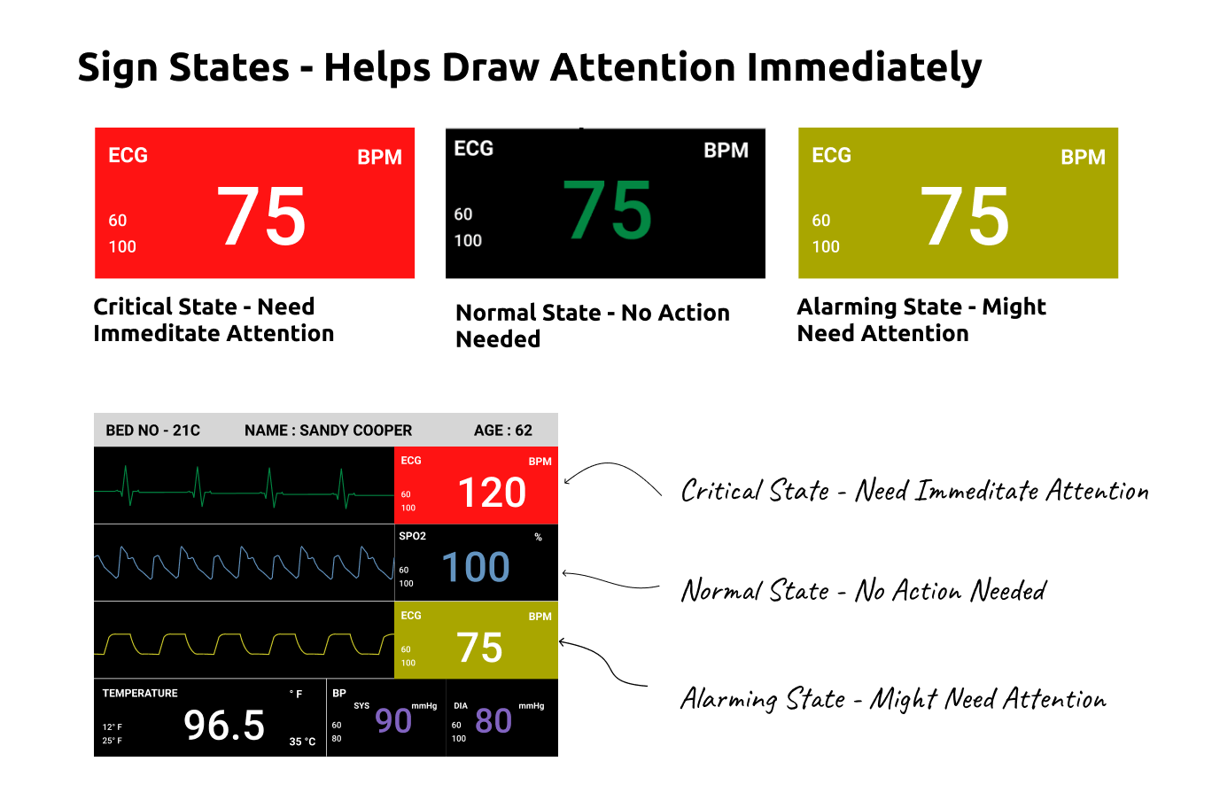
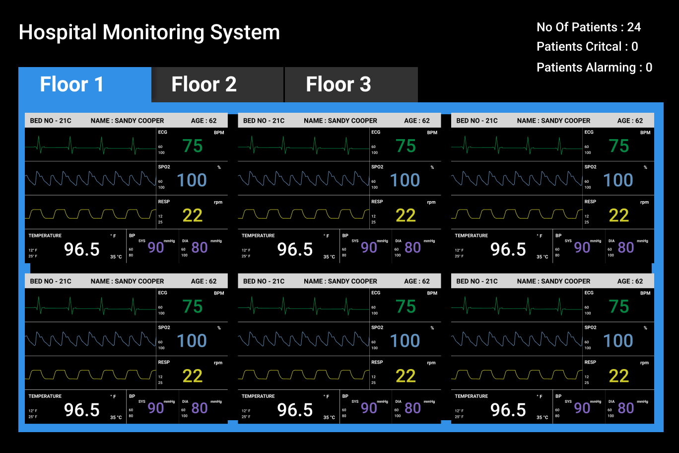
Taking inspiration from the currently existing monitoring models I had to break down the real estate of each screen into 6 sections (Because we were given to measure 6 vital signs) and then appropriately adjust them accordingly.
The hierarchy is based on the type of data here's how I organized them :
- The signs that used graphs to visualize, I put them first and split them in a (Graph - Data ) Row
- The ones which don't use a graph, I arranged them next in the hierarchy.
Also, these were designed were iterated based on the feedback and dry user testing done on the wireframes, and keeping in mind the mental models of the nurses.
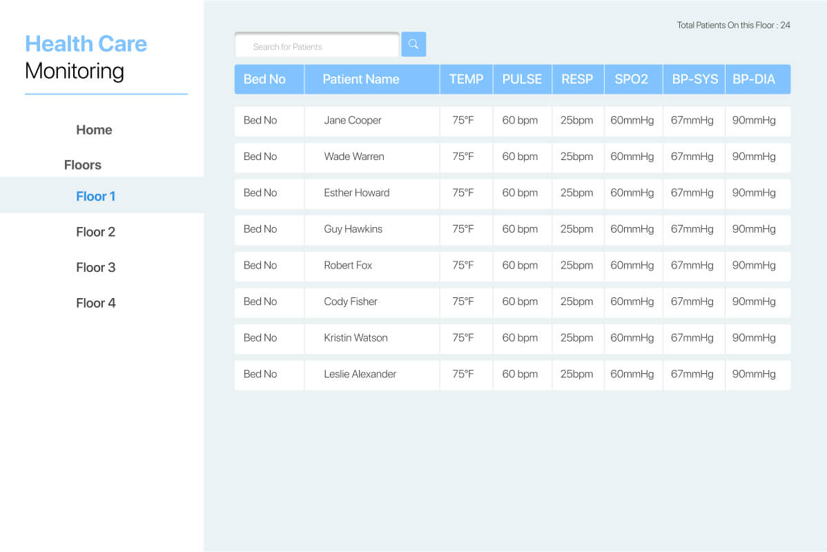
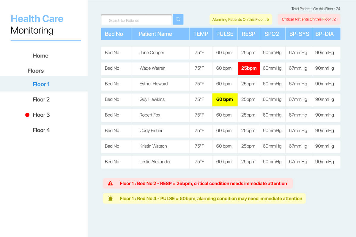
Here's what I came up with :

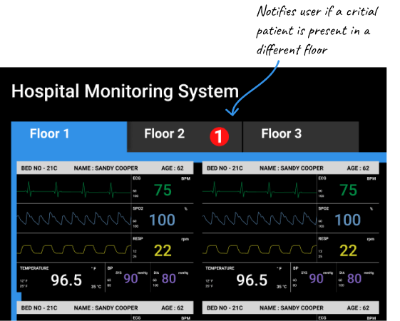
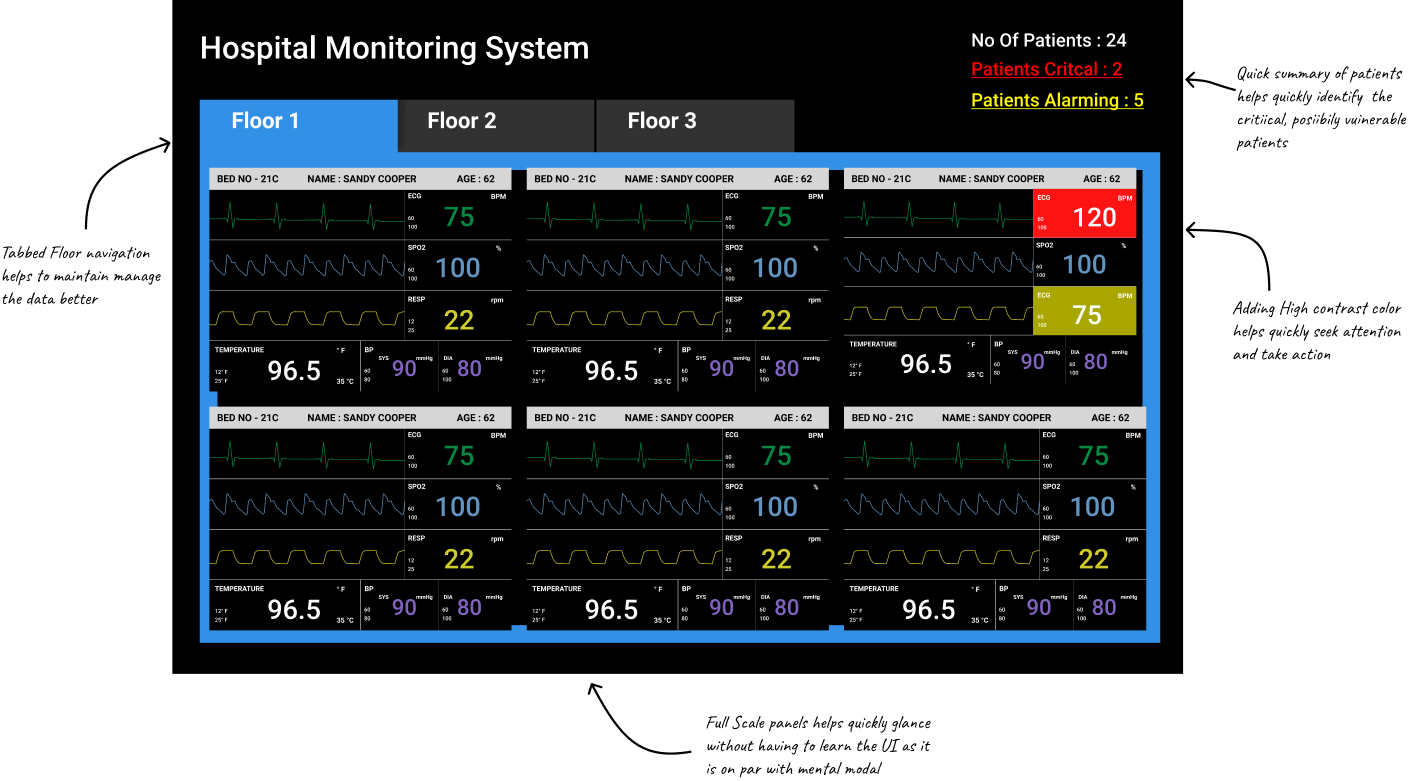
What Worked:
What Didn't: